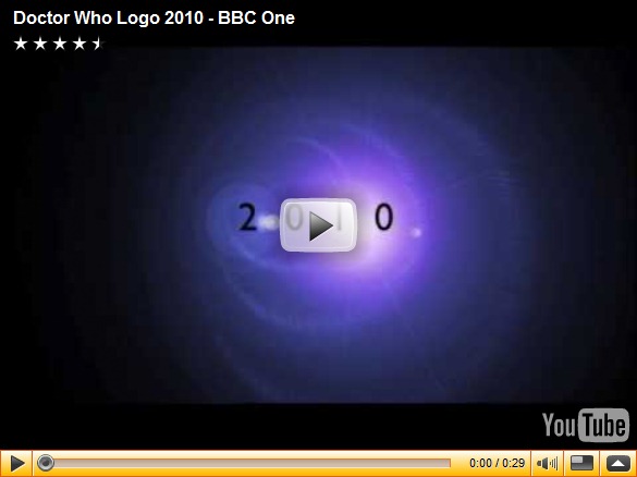
A new era means a new logo - and the Steven Moffat era of Doctor Who continues to take shape with the unveiling this morning of a new graphical identity for the show.
Combining a 3D design with the serif-bound authority of the Patrick Troughton era logo, this is the new look for Doctor Who embodied in visual form!
It looks pretty good, especially in it's mirroring of the Paul McGann colour scheme.
Plus, it isn't orange!
Get ready to see this new visual shorthand for Doctor Who on merchandise, books, Doctor Who Magazine, duvets and everything else that fans of the series like to spend money on - and expect it to instantly date the current "taxi cab lozenge" design.


0 comments:
Post a Comment